Wallpaper aesthetics are genuinely personal — but certain styles pair more naturally with specific work contexts, operating system configurations, and screen brightness settings. Here's a practical guide to the major style categories and how to choose between them.
Minimal and single-tone
Minimal wallpapers — single-colour fields, simple gradients, or subtly textured solid backgrounds — are the most versatile category. They work in any light environment, pair naturally with both Light and Dark Mode, don't compete visually with any application content, and make the desktop feel clean and organised regardless of how many Finder icons are present. The downside is that they can feel bland if the rest of the desktop isn't equally considered. Best for: focused work sessions, presentations where your desktop may be briefly visible to others, and anyone building a cohesive aesthetic around a specific colour palette in their app choices.
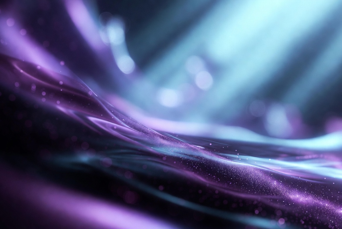
Dark and cosmic
Dark wallpapers — deep space photography, dark abstract renders, low-key night scenes — pair naturally with macOS Dark Mode and reduce overall screen brightness in dim environments, which can reduce eye strain during long sessions. Space and nebula photography specifically has remained persistently popular for Mac desktops because the colour palette (deep blacks, vivid purples, blues, and teals) maps naturally onto the accent colours of the macOS interface. Ideal for: evening or night work sessions, developers who prefer dark everything, and Dark Mode users who want a consistent dark aesthetic throughout the workspace.
Nature and landscape
Nature photography — forests, coastlines, mountain ranges, sky — provides visual variety and a sense of openness without being distracting. The category is broad enough to span minimal (a single mountain against a clear sky) and complex (a dense forest canopy). High-resolution nature photography from Unsplash tends to be consistently excellent in this category, with professional-grade landscape work freely available. Best for: general daily use where the wallpaper needs to be pleasant across many hours, and users who find pure abstract or minimal wallpapers too stark.
Abstract and geometric
Abstract wallpapers — geometric shapes, fluid simulations, mathematical renders, parametric designs — cover a wide quality range. At the high end, well-designed abstract wallpapers are visually interesting without being distracting. At the low end, they can feel cheap or chaotic. The practical filter: if you're still noticing and appreciating the detail in an abstract wallpaper after a week, it's a good one. If your eye has already stopped registering it, it's either too complex (overstimulating) or too bland (forgettable).
Gradient and colour field
Gradient wallpapers sit between minimal and abstract — they have colour and visual presence without literal subject matter that competes with application content. macOS's own built-in Dynamic Desktop gradients (the coloured blob backgrounds introduced with macOS Ventura and later) are Apple's take on this style: tasteful, well-executed, and highly compatible with both interface modes. Custom gradient wallpapers allow more specific colour matching to personal preferences or design aesthetics. Best for: anyone who wants visual interest without photographic subject matter, particularly when working in design applications where the desktop colour affects colour perception.
Matching style to workflow
The practical approach: keep a small rotating library (15–20 images) spanning two or three style categories, and let macOS's shuffle feature rotate through them daily. This provides variety without the decision fatigue of choosing a wallpaper manually, and prevents any single wallpaper from becoming invisible background noise through overexposure. Pair whatever style you choose with a clean, uncluttered desktop — no Finder icons if avoidable, a minimal menu bar — and the combination has more visual impact than any individual wallpaper choice made in isolation.
Building and managing a personal wallpaper library
The most satisfying wallpaper setups over time tend to involve a curated personal library rather than using whatever was found most recently. A practical structure: one folder per aesthetic category (minimal/dark/nature/abstract), 10-15 images per folder, refreshed quarterly by removing anything you've stopped appreciating and adding new finds from Unsplash or similar sources. macOS's shuffle feature then rotates through whichever folder you designate as the active set, providing daily variety within a consistent aesthetic rather than random variety across all aesthetics at once. The library is also a kind of personalisation record — the choices you add and remove over time reflect how your aesthetic preferences actually evolve, rather than being locked into whatever you liked when you first set up the Mac.
Frequently asked questions
What wallpaper style is best for focus and productivity?
Minimal and single-tone styles are the most research-consistent recommendation for focus — they reduce visual complexity that the brain has to filter out. Dark gradients work well for Dark Mode users. Avoid high-detail photography or busy abstract patterns during deep work sessions.